

Brand Mark Collection
PROJECT
Logo and Brand Mark Collection
CLIENT
Multiple
ENGAGEMENT TYPE
Freelance
OVERVIEW
Every logomark in this collection started with research — into the brand's history, competitive positioning, and the emotional territory it needed to own. The goal in each case was the same: a mark that's immediately legible, built to last, and unmistakably right for that specific business.
RESPONSIBILITIES
I led brand identity development from brief to final lockup across each project. That meant digging into research and brand strategy before touching a single form, then working through concept development, shape exploration, colour, and typography until the mark felt inevitable. Each logo was designed with the brand's long-term growth in mind, not just how it looks at launch.
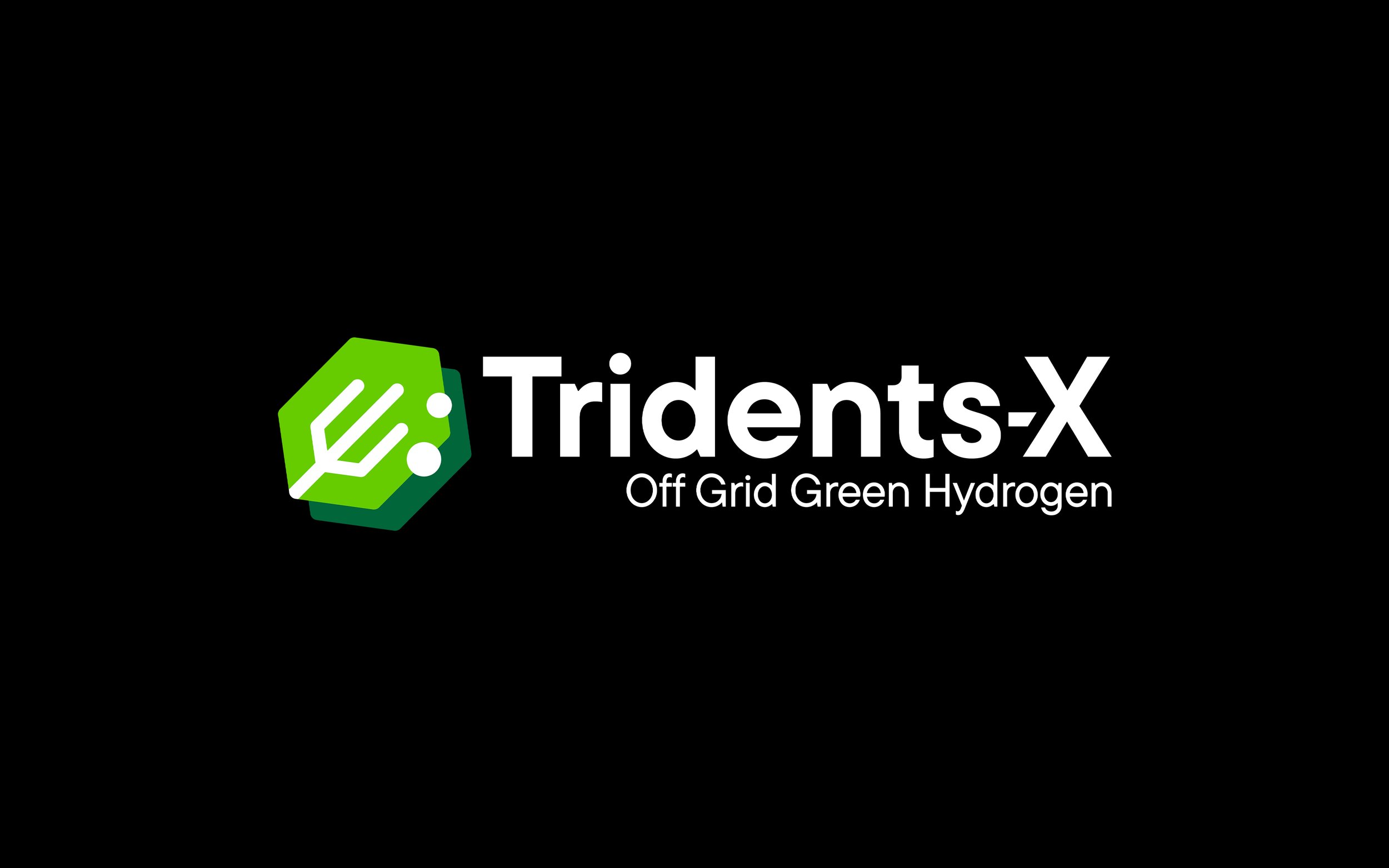
Tridents-X | Green Hydrogen Company
An authoritative identity built around structure and precision. The mark positions green hydrogen as a serious, scalable solution, not a fringe concept.
Scientific | Sustainable | Structural
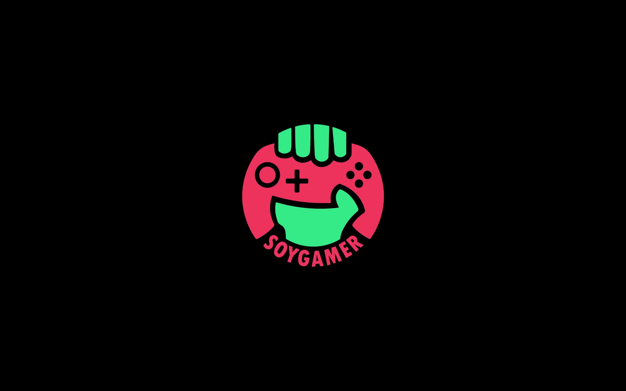
Soy Gamer | Gaming Community
Bold, unapologetic, and built for a community that wears gaming as a badge. The visual language leans into energy and pride without taking itself too seriously.
High-energy | Defiant | Community
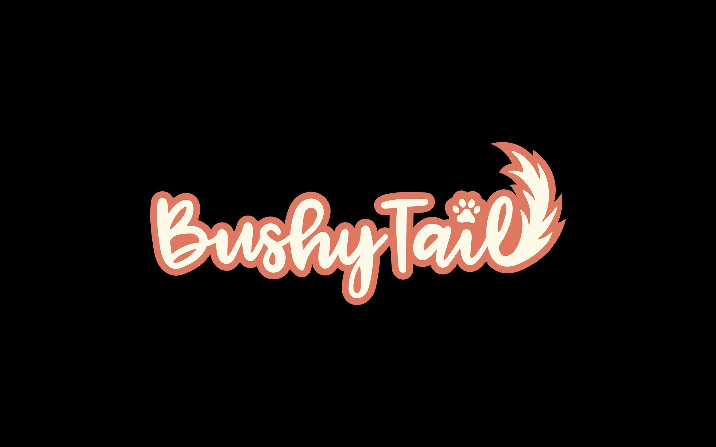
Bushy Tail | Pet Store
A brand with genuine warmth. The mark prioritises personality and care, setting Bushy Tail apart from the mass-market pet retail aesthetic.
Warm | Approachable | Playful
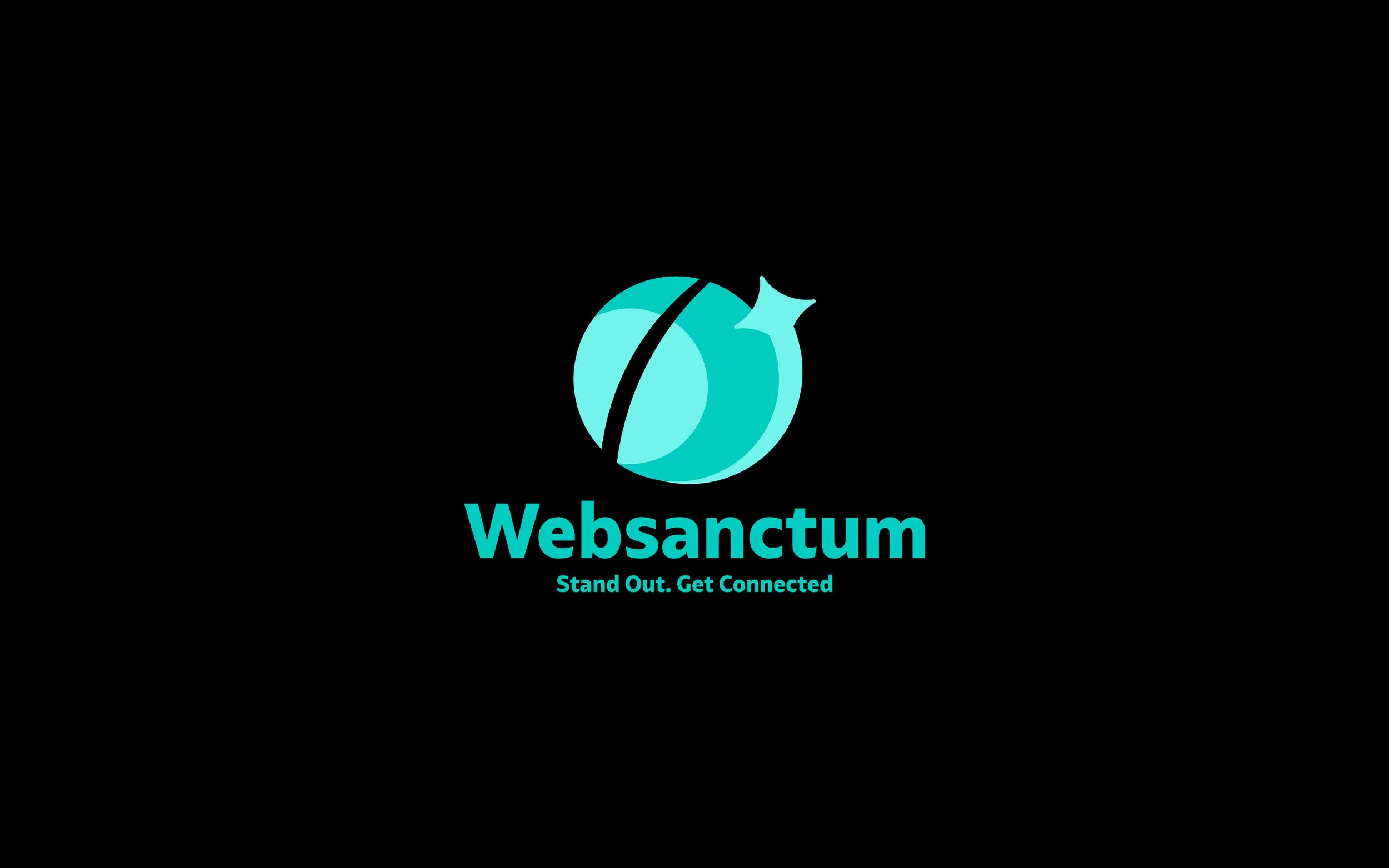
Web Sanctum | Job Portal
Clean and confident, with a sense of security built into the form. The mark signals a platform that connects people to opportunity without feeling cold or corporate.
Global | Secure | Modern
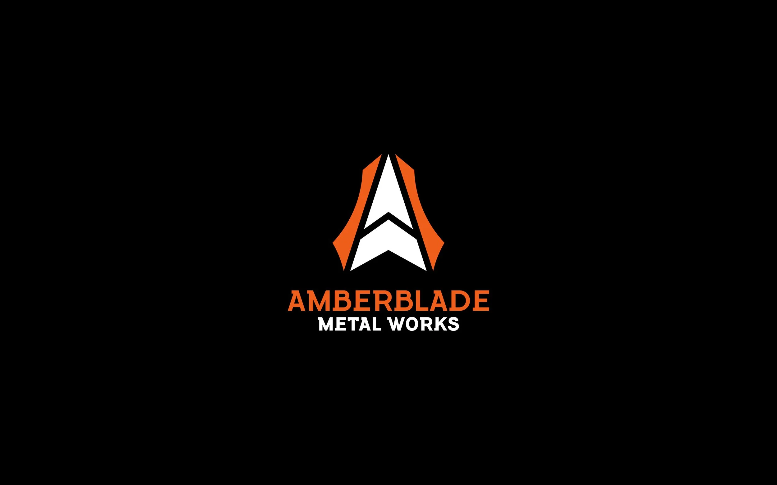
Amberblade Metal Works | Forging Factory
Industrial weight meets precise execution. The mark captures both the raw power of the forge and the exactness that modern fabrication demands.
Industrial | Precision | Sharp
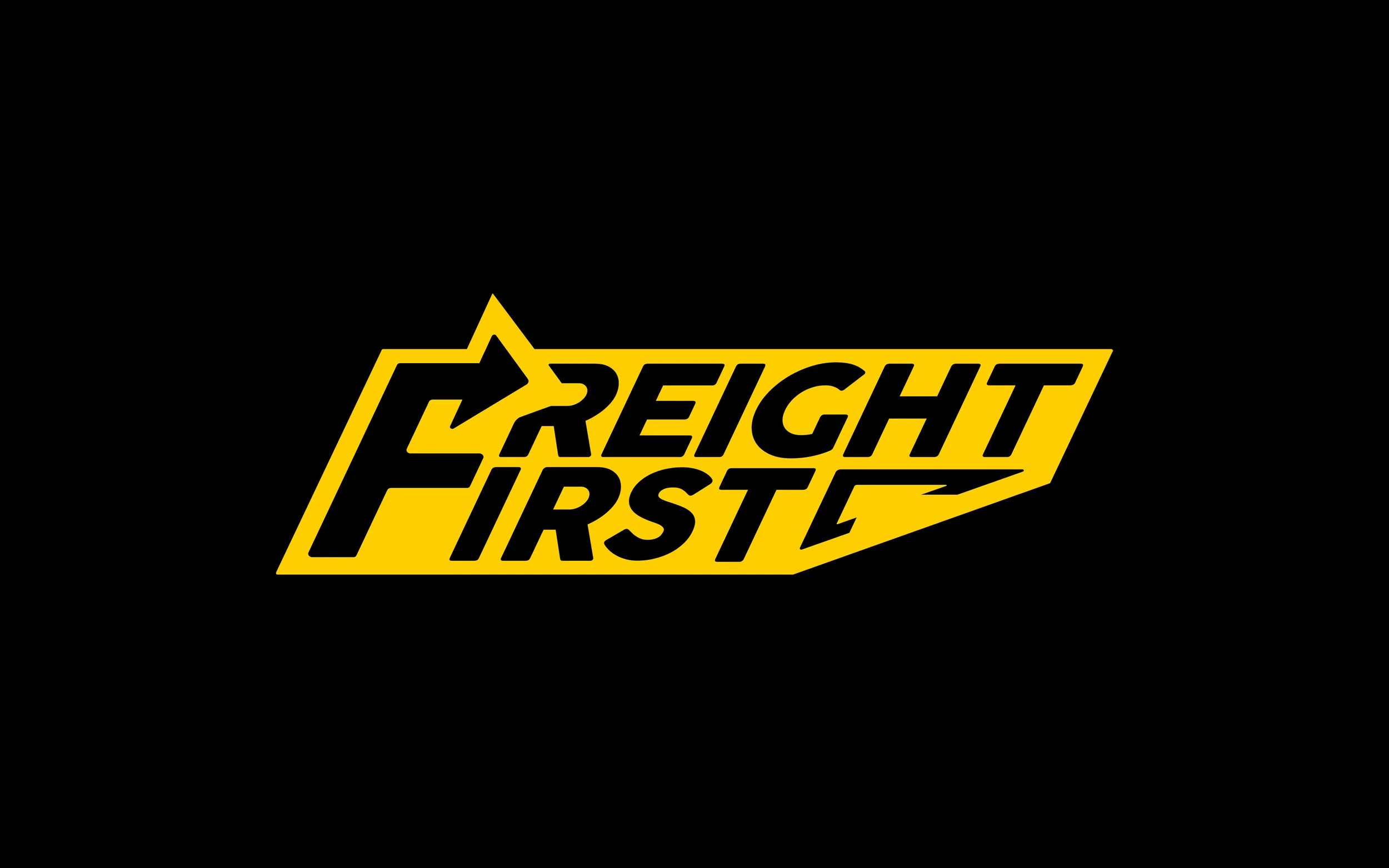
Freight First | Logistics
Drawn from the visual language of industrial signage, the mark communicates authority and reliability at a glance. It looks like it means business because it does.
Rapid | Cautious | Direct
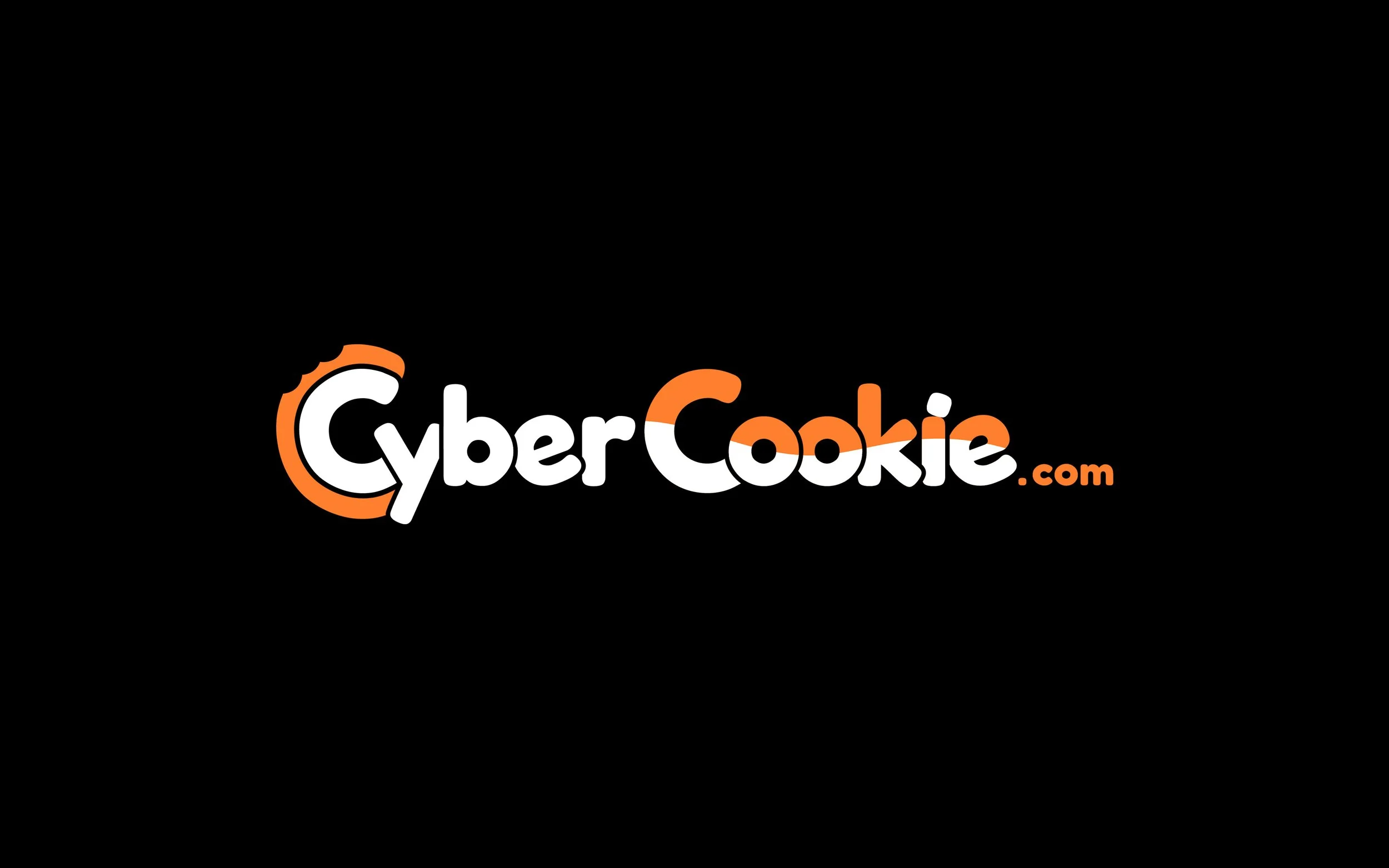
Cyber Cookie | IT Solutions
IT doesn't have to be intimidating. The mark reframes technical complexity as something approachable and even a little fun, without losing credibility.
Digital | Savvy | Delightful
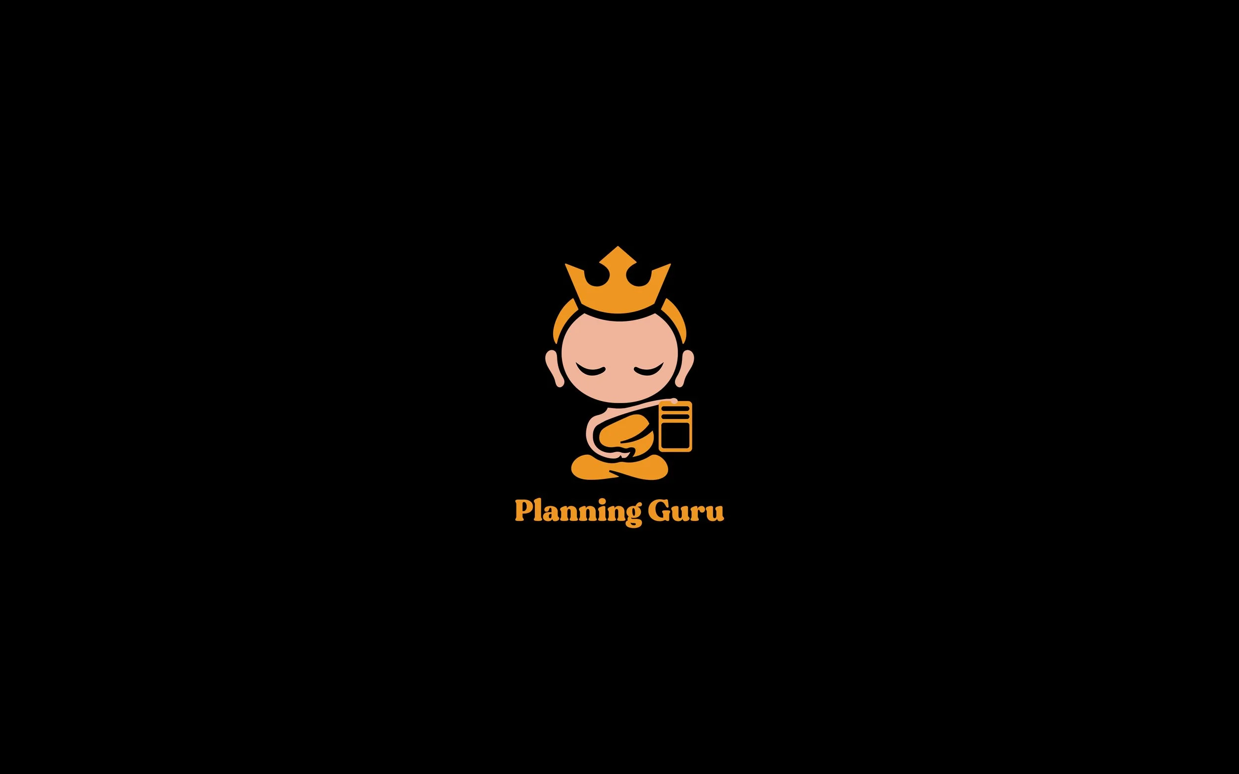
Planning Guru | Event Planning Company
Calm in a category that's usually anything but. The mark promises clarity and control, the feeling that whoever is holding this card has everything handled.
Calm | Organized | Wisdom